OVERVIEW
300,000 individuals facing food insecurity in San Diego.
As a team member of the Data Science Alliance we’re on a mission to help serve our community through data-driven solutions, in this project we tackled food-insecurity confronted by many San Diegans.
The food banks’ initiatives and decision-making were based on historical distribution trends dated 4-6 months back that don't reflect the current state of food demand. This led to overlaps in food supply to specific regions, zip codes, and counties in San Diego. Furthermore, distribution amounts didn't align with the current socioeconomic trends and demographic data insights.
DASHBOARD APPROACH
Fighting Hunger w/ Data-Driven Insights.
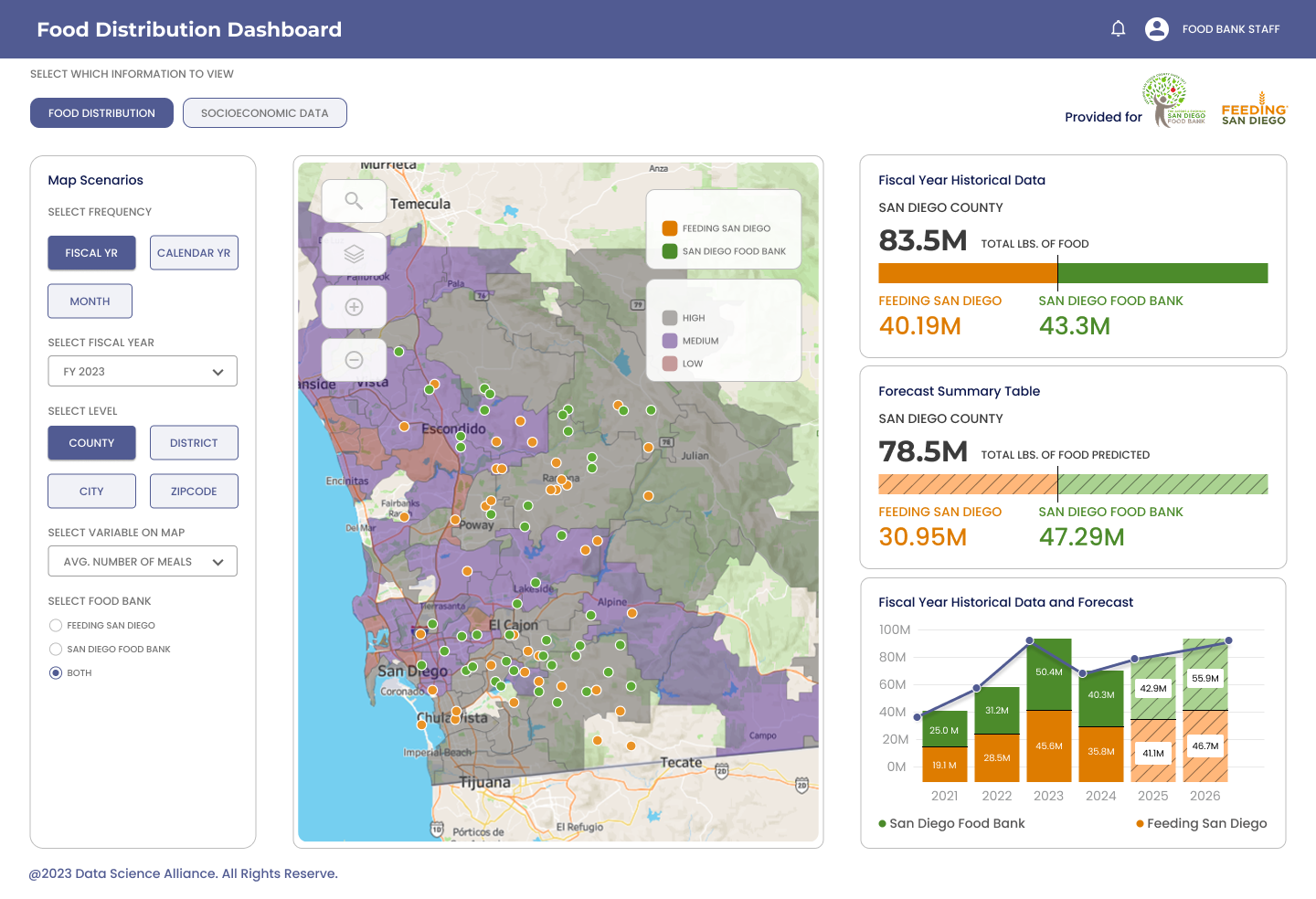
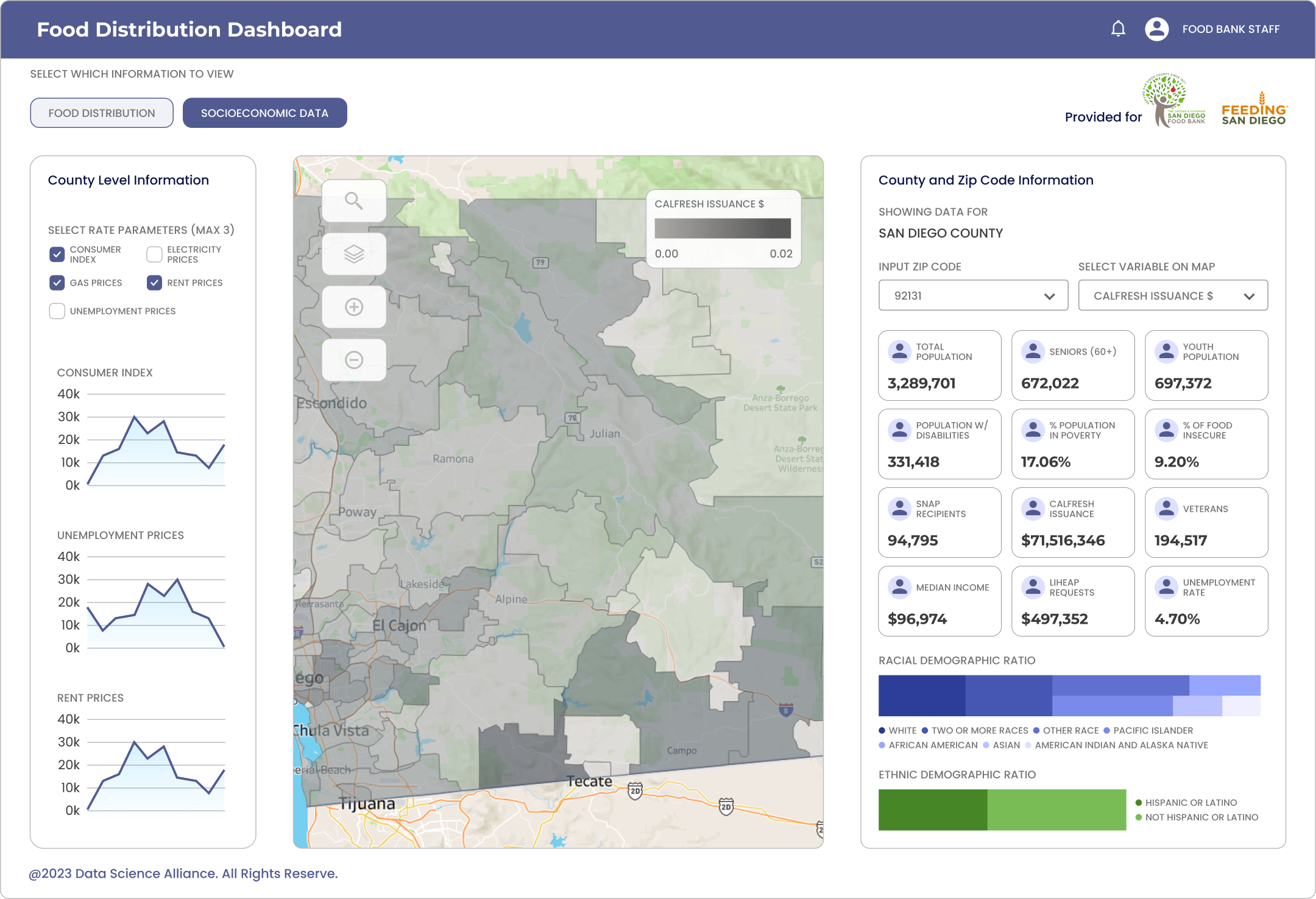
To optimize the food bank’s operations and strive for data-driven decision making I created an executive and operational dashboard with a predictive model that forecasts food assistance across San Diego County maximize their efforts effectively.
feature highlights
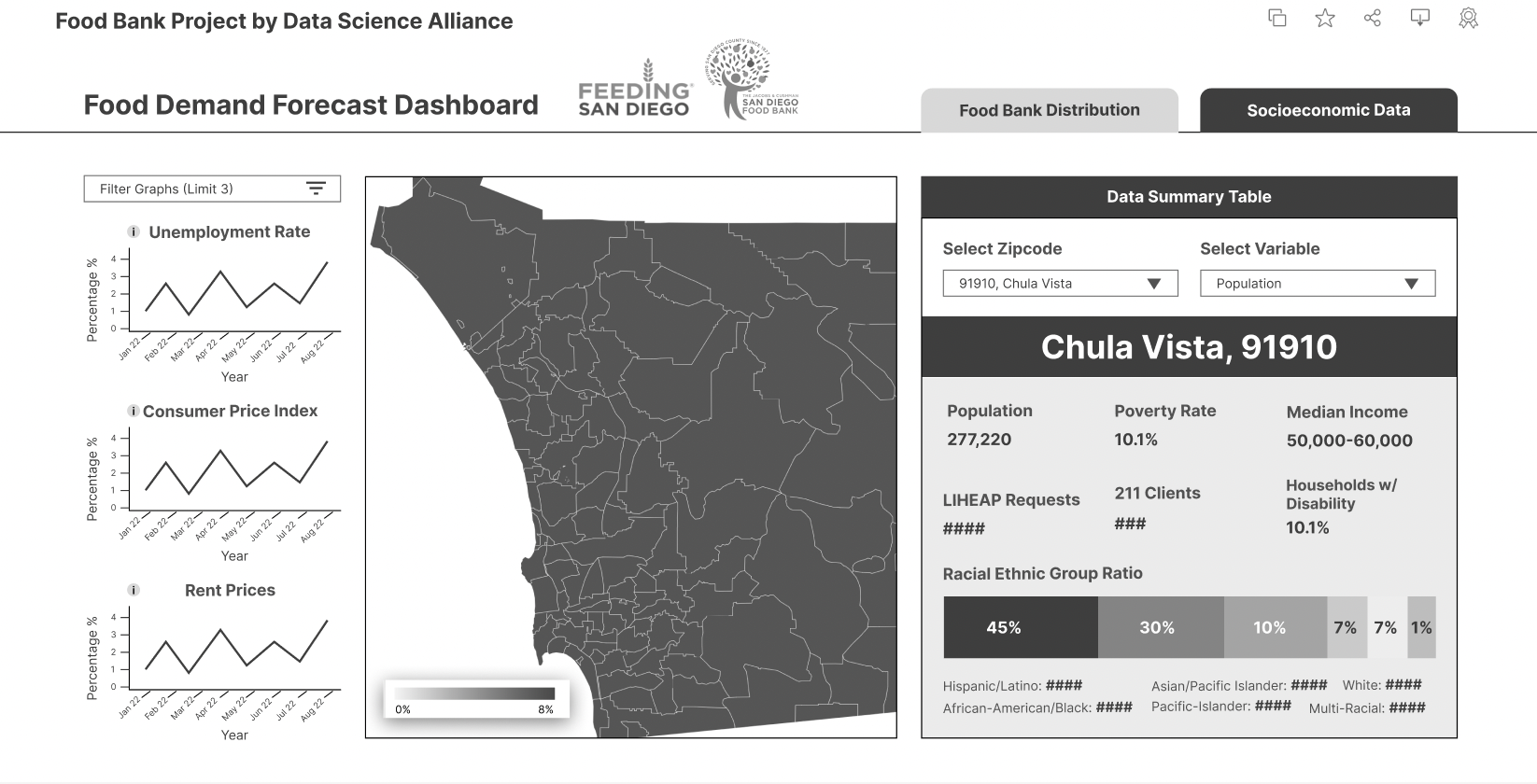
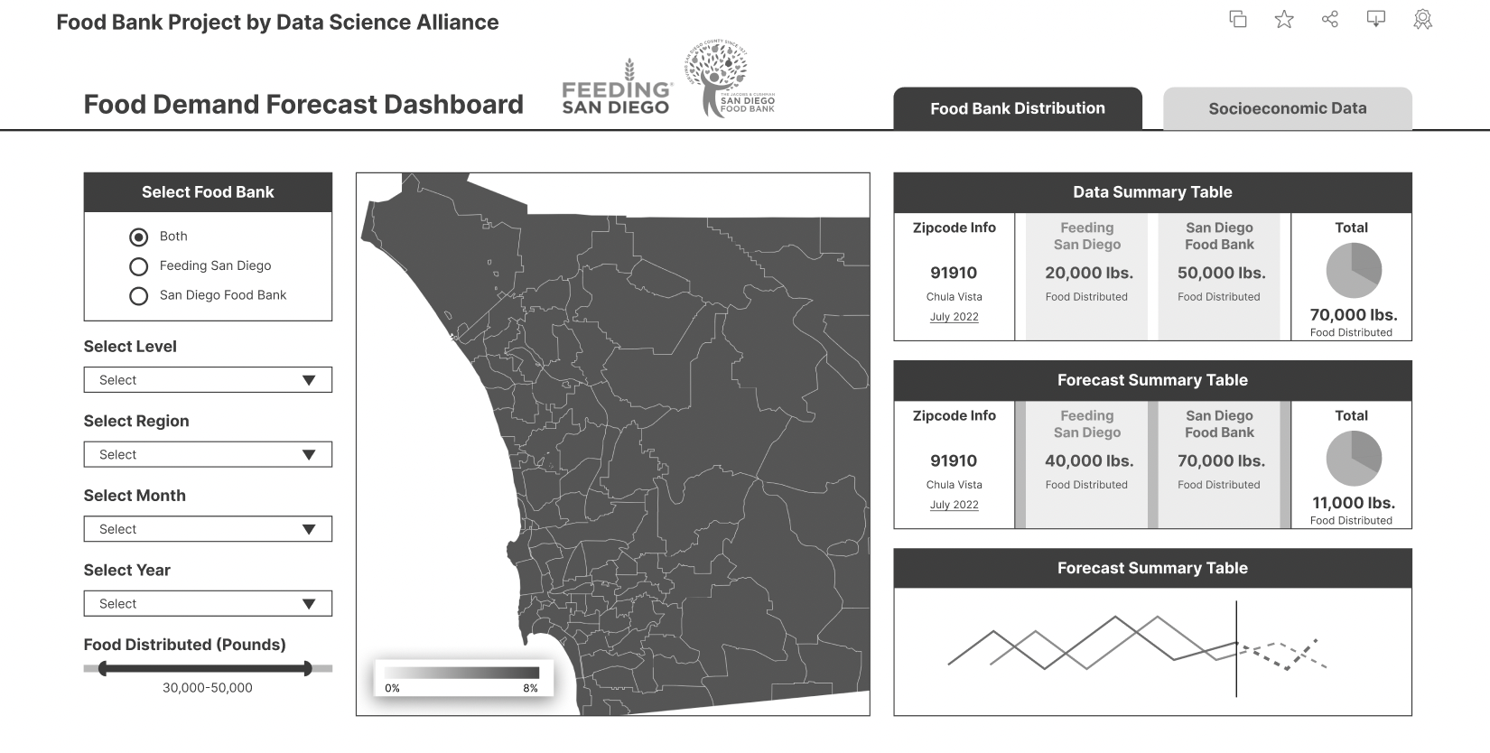
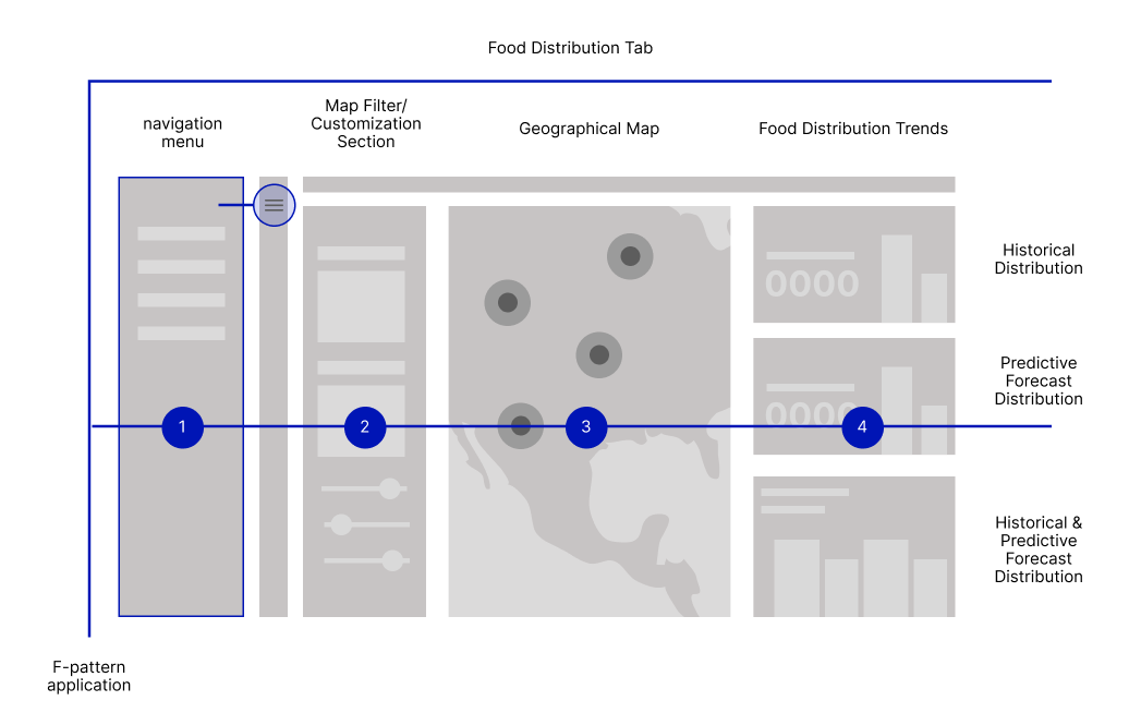
1. Geographical Map indicates hotspots of low food distribution with high food insecurity.


2. The food bank teams can take action ahead of time by assessing the trends of their historical data and a robust predictive model in a visualized and digestible format.
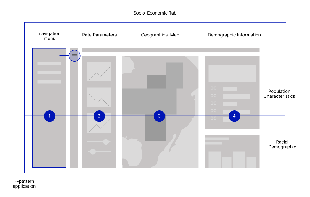
3. We included socioeconomic data to assess how it affects the food insecurity demographic.
the impact
29 million pounds were effectively distributed across San Diego County.
We also fostered and strengthened the partnership between SDFB and FSD to continue forward with their efforts together.
Beyond San Diego, we've received California District Recognition to potentially bring this dashboard to other food banks across the state!
USER RESEArCH
We met with 12 executive team members to understand how they utilize the data in their work. Presenting data reports is a crucial part in their role.
USER INTERVIEWS & surveys
We conducted surveys to understand how they utilize the data to support their work, their pain points, and the needs with the data they analyze and report.

CEO
Stewards annual and five-year budget plans and business operations.

Data Analyst
Analyzes, gathers, and interprets data into reports on distribution logistics, donation trends, and business operations.
Programs & Supply Chain
Oversees the coordination of food distribution programs that maintain reliable food distribution across the county.

Finance Directors
Work closely with leadership to allocate resources effectively, ensuring funds are directed toward impactful programs and operations.

Grant Management Specialist
Oversees grants that fund food distribution initiatives. Track funding allocations and meet with outside stakeholders to secure financial resources critical to food bank operations.

Director of Programs
Develop and oversee community partnerships, evaluate program effectiveness ensuring it aligns with community needs.
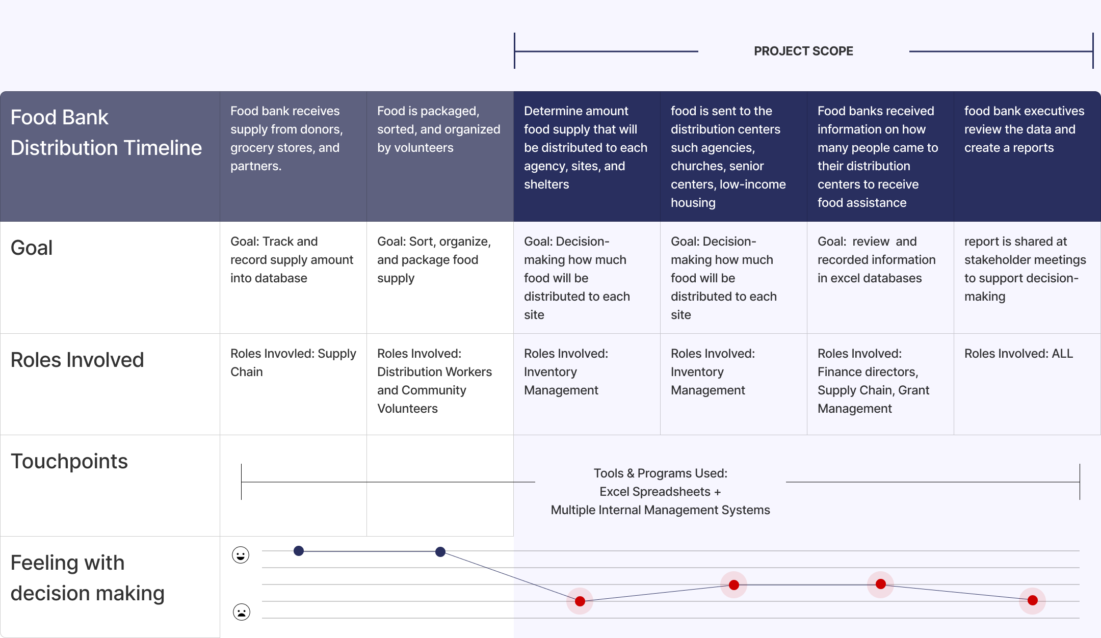
User Journey
We discovered that the food banks had only 5% of communication with each other in regards to distribution efforts across San Diego. Their databases were also sourced from multiple different internal systems.
Gathered insights
Inefficient supply distribution and lengthy report processes, were caused by lack of data-driven decision making.

Over Supply/ Under Supply
The two food banks were over serving the same zip codes or underserving specific areas.

Decision-making was based on outdated data
Food distributions were based on data collected 8-9 months past, which doesn't reflect the current state of the food insecurity landscape.

Reports take too much time to complete
The teams have their datasets stored in different internal management systems.

Numbers with no visual context
They have difficulty identifying trends and had no data visualization to really understand how their food assistance impacts the community.
NEEDS
1. Data-driven insights to drive decision-making and collaboration.
2. Identifying hunger hot spots in San Diego County.
3. Visualized report of food bank’s distribution based on specific time period to be shown to stakeholders.
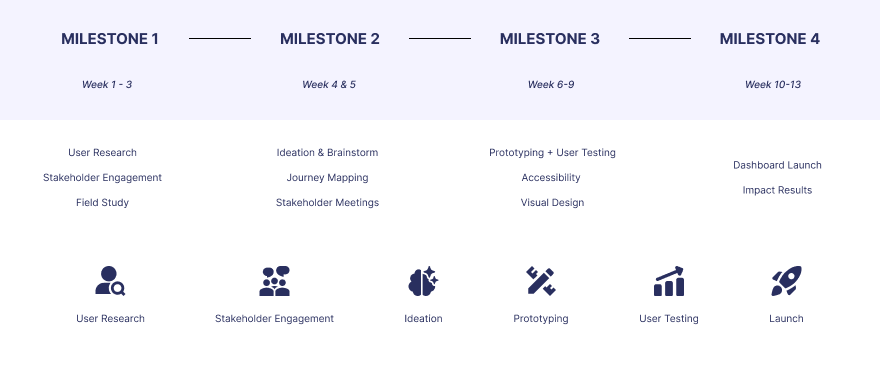
IDEATION
We’ve concluded the best approach was a combination of an Executive and Operations dashboard to identify patterns in food assistance landscape and optimize operations for future demand.
DASHBOARD GOALS
We kept these three goals in mind as we went onto the prototyping process.

Puzzle Together
We collected all the data sets and metrics together into compelling visualization with data storytelling.

Identify & Coordinate
The dashboards information architecture is aimed to spot patterns.

Improve Communication
With visual cognitive processing in mind, valuable insights are seen at a glance to create efficient communication amongst the executive team.
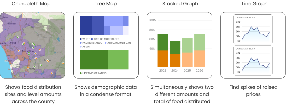
IA + DATA VISUALIZATION
Graphs were chosen based on the accuracy of relationship between other metrics and how it displays change over time.
INFORMATION ARCHITECTURE
Our Challenge: putting all the metrics together in a single screen without comprising cognitive overload.
CHALLENGE
We encountered long approval process times and finding visual balance with the datasets.
CHALLENGES
Because we we’re working with two organizations, it was difficult to find alignment of schedules and conduct usability testing in-person. Since each business operates differently, multiple conversations and approvals were necessary before proceeding.
1. Long-approval process time.
2. Two different business practices.
3. Finding visual balance and harmony between the datasets.
4. Avoiding visual cognitive overload.
user feedback
Each role values reporting data in different frequencies and each food bank operates on a different reporting basis.
FEEDBACK #1 + APPLICATION
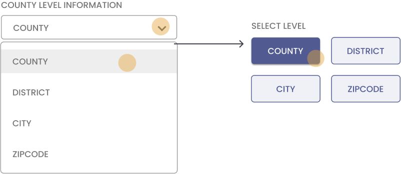
They wanted to quickly switch back and forth between the level and frequency selections. Drop Down vs Selection Buttons: We established that any data set with more than 4 selections will remain a drop-down menu.
FEEDBACK #2 + APPLICATION
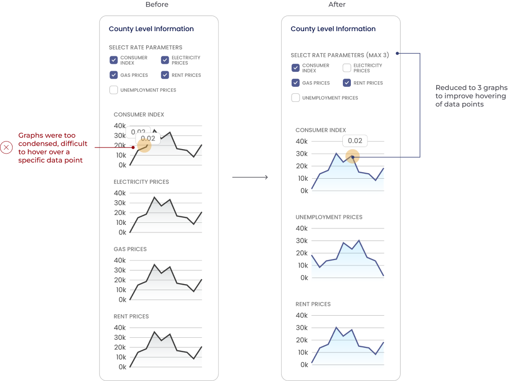
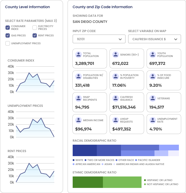
Rate Parameter Graphs: We reduced it from 4 to 3 graphs displayed to improve the selection of data points. We added an option to select more than 3, but explicit noted that 3 provides the best data visualization.
feedback #3 + application
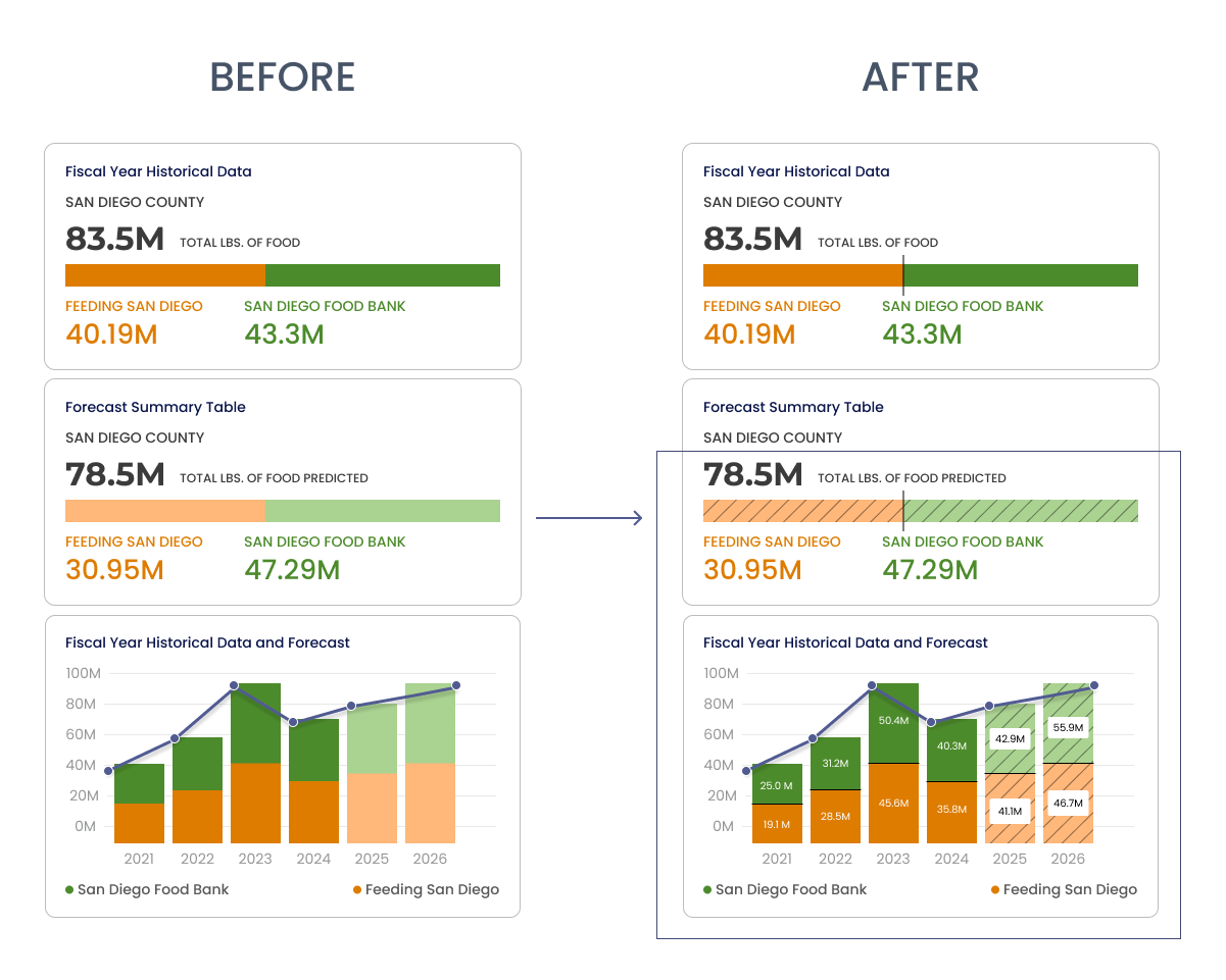
The food banks had trouble seeing the color difference between the historical and predictive, a pattern was added to increase visibility and distinction.
CONCLUSION
My knowledge of data visualization has grown and so has my experience in working cross collaboratively with not just diverse roles, but two different business that involved a lot of agility and flexibility. However, we remained driven till the end by making a difference in our community :)